Itaú
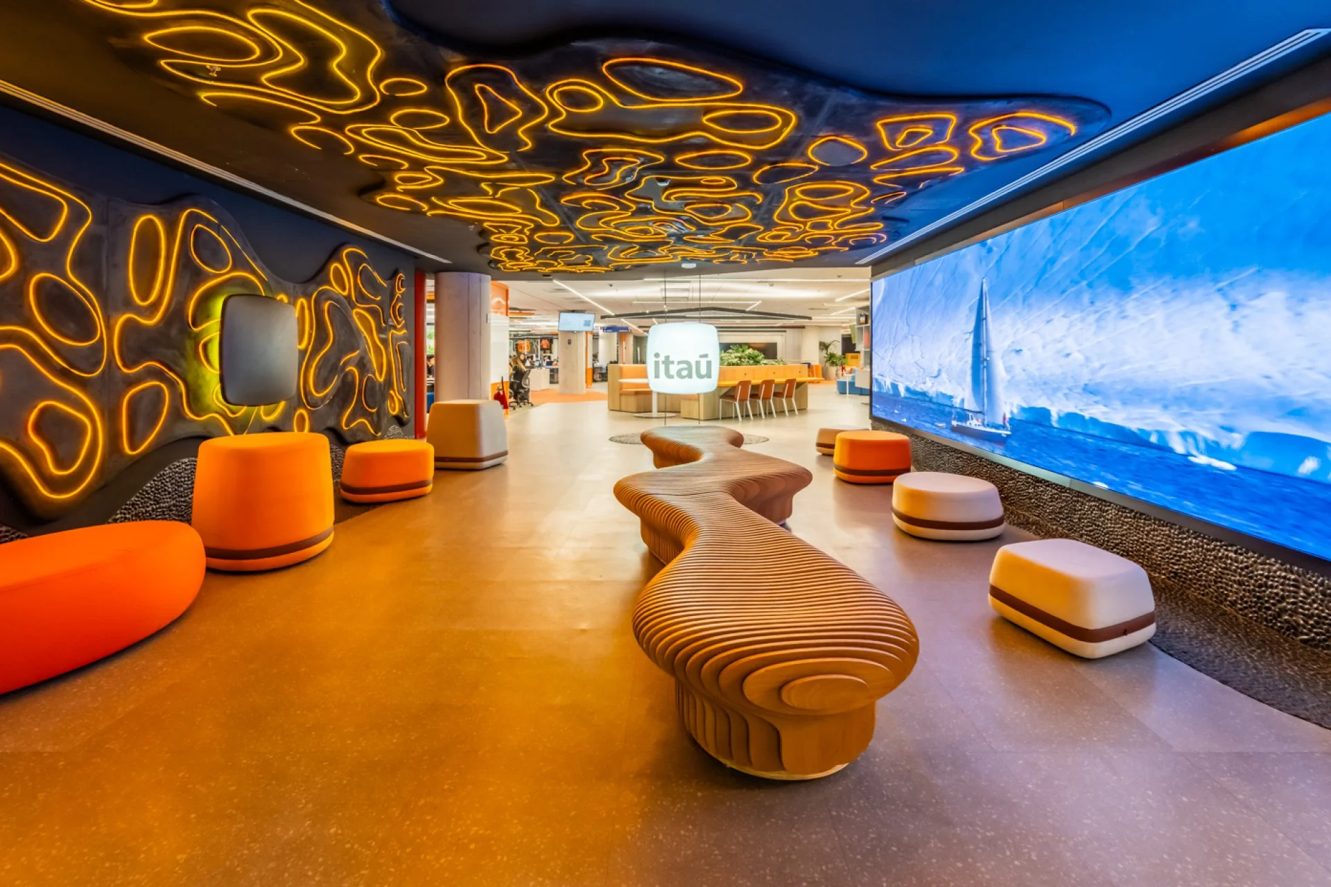
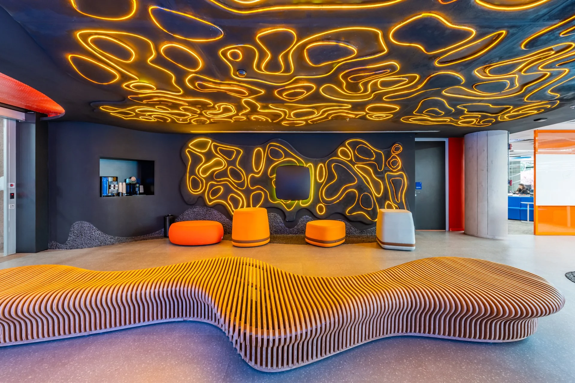
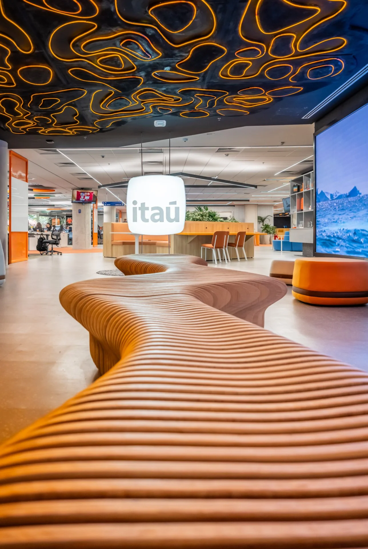
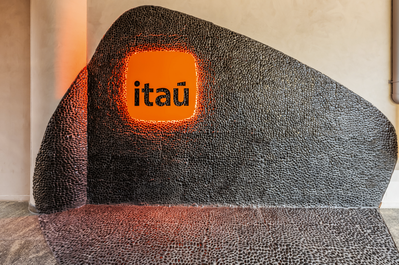
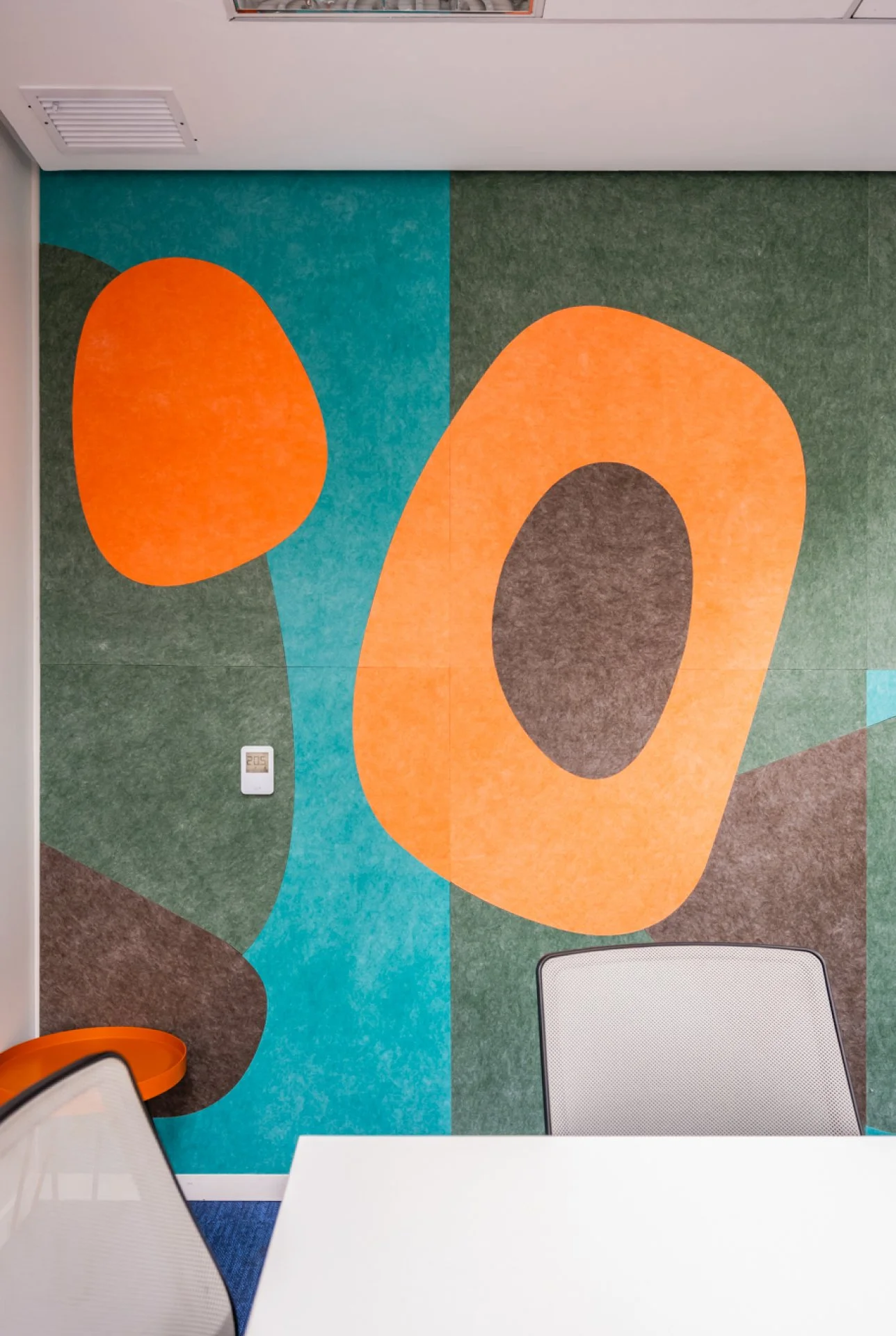
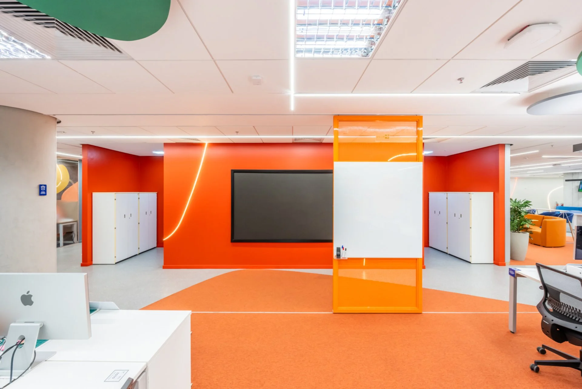
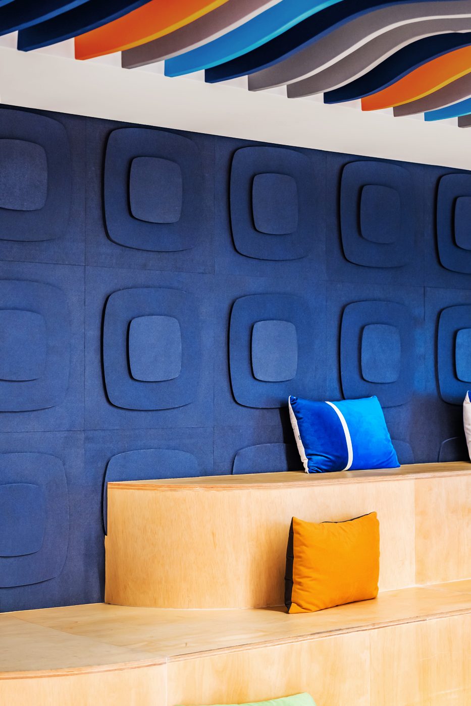
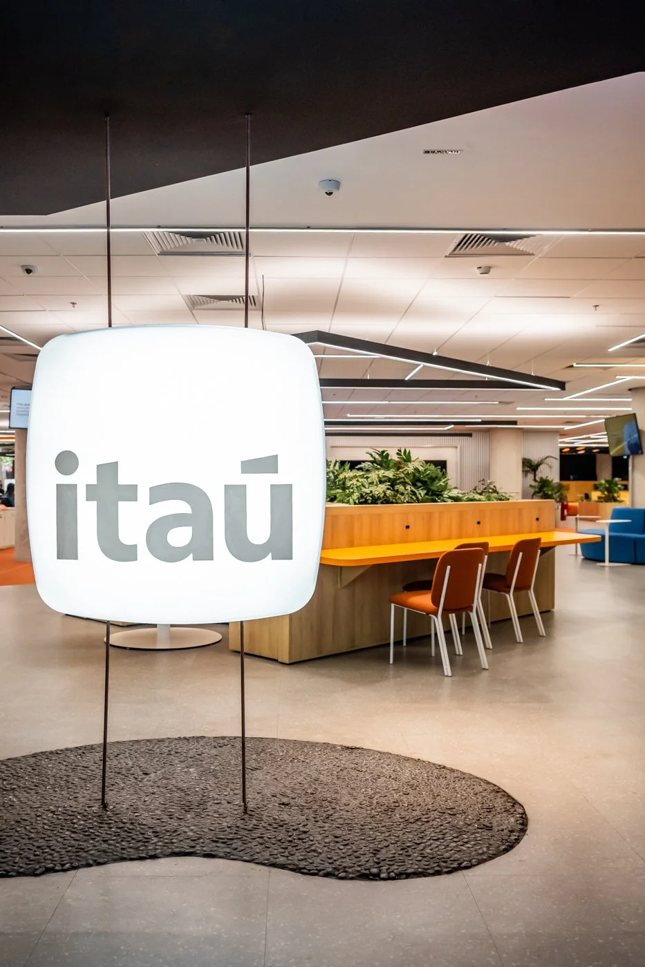
The project translates Itaú’s rebranding into a physical space, going beyond the logo to transform the brand’s entire ecosystem. The interior design incorporates black stone—a symbol of solidity—to convey a sense of accessibility, fluidity, and innovation. Developed through co-creation with various teams across the bank, the use of local materials, such as stone and ceramics, reinforces a sense of belonging and Brazilian identity.
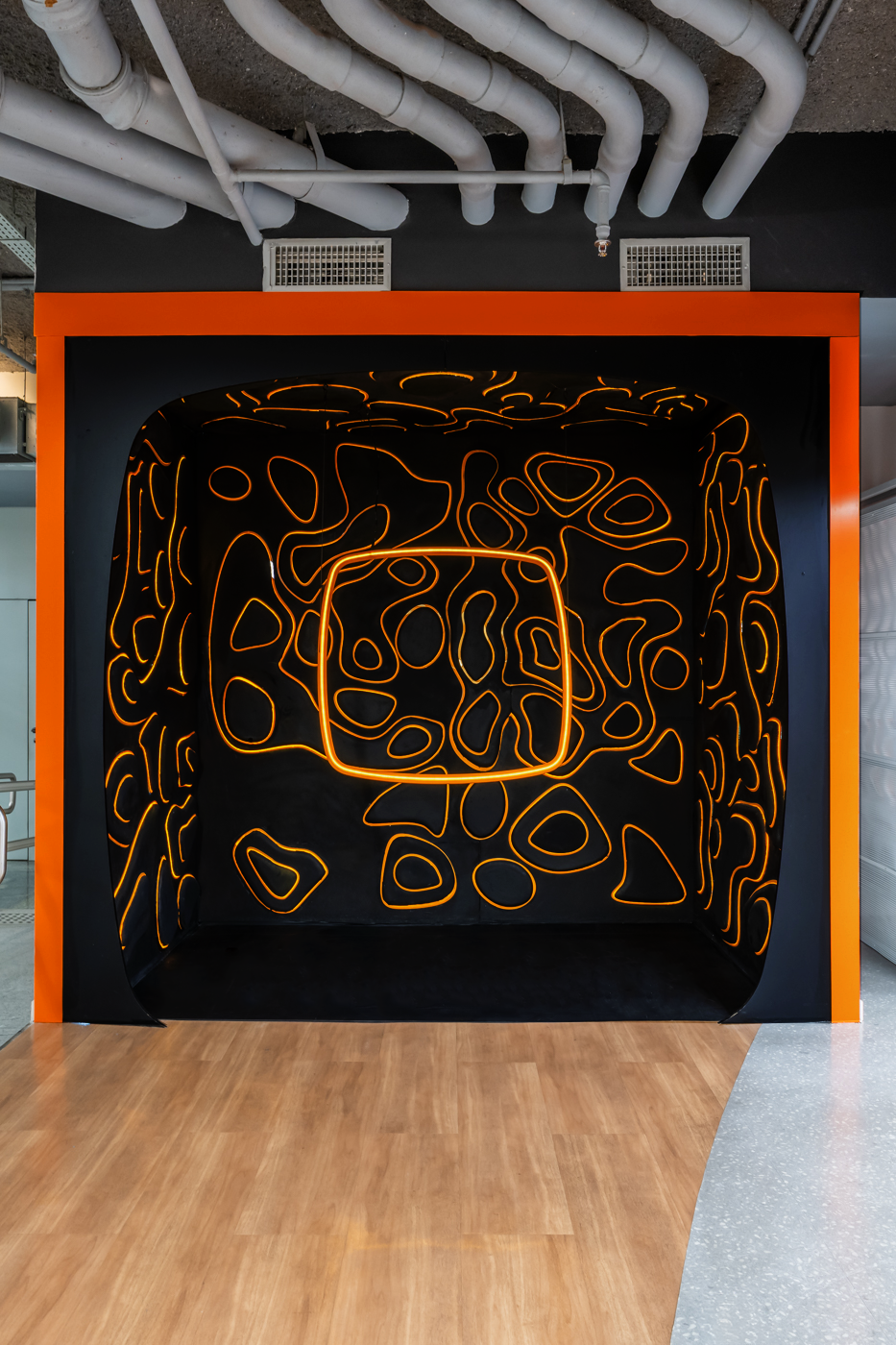
The architecture prioritizes sensory activations over a literal application of the brand. The "Magma" graphic motif combines 3D relief with dynamic orange lighting to create an immersive experience. The result is a vibrant, hybrid work environment that fosters connections, strengthens corporate culture, and actively reflects the essence of the brand.